Thursday, July 29, 2010

Color Journaling Week Seven!


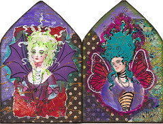
This week's color scheme is.... Olive Green, Turquoise and Black!

I have always loved dolls, and as a kid enjoyed collecting them. For the past few years I have really liked the aesthetic of the Asian BJD dolls, or Ball Jointed Dolls. While I do not own a BJD (They don't come cheep at around $500 on average!) I have fun looking through doll colloector magazines and seeing collectors post their images online. Many of these BJD owners are very gifted in fashion design and photography.

here are a few links:

http://www.dollmore.net/

http://dreamofdoll.com/eng/main/mapage.asp


http://www.eluts.com/

BJD's were an inspiration this week with the olive, turquoise and black scheme! Gothic novels (can we say cheesy late sixties covers?), Paris and BJDs seem to go together!

I have noticed that challenge blogs out there like gothicarches.blogspot.com have these cool little "Mister Linky" widgets. So if anyone would like to share their olive,turquoise and black art work, feel free to link yourself here! (ignore #1 - lalala, that was a test and will only take you to ArtTraderMag.com! haha)

I'd like to share a cool piece of art based on last weeks Red & Purple prompt!

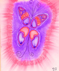
It's made by Tammy of Tammy's Studio, and you can visit her awesome blog here: http://blog.tammysstudio.com/


NEXT WEEK: If you want to get a head start for next week, the scheme is White, Rose and Gold!


Olive, Turquoise and Black: Share your art here!


Sunday, July 25, 2010

Marie Antoinette Gothic Arch


Something fishy is going on......

I thought I'd participate in the Gothic Arch Challenge blog's Marie Antoinette prompt!


My video on this technique can be found on my YouTube channel:
http://www.youtube.com/watch?v=04Kv7MHQIq0

Friday, July 23, 2010

Color Journal prompt week six!

For information about the Color Journaling Project, click above!


For this week I thought I'd try another tri-color scheme, Ivory white, Burnt sienna, and Cerulean blue. Together these colors evoke cool salty sea breezes, a bring respite from the warm sun that bleaches stone buildings and wood washed up along bright white beaches.


Lawerence Alma-Tadema (whose most popular work was created around the turn for the 19th and 20th century) was very much inspired by ancient classical imagery, and many of his paintings feature a coastal Mediterranean setting.

For this week, try using Ivory White, Burnt Sienna and Cerulean Blue to capture your own bit of your own paradise.

For my 5x7 color journal I've create a collage mixed media piece and taken a video, hope you enjoy!


And please share your work at our flickr group! Everyone is welcome to join! Coming up this next week, I plan on featuring, at my blog, some of the work by our group members!

Keep Arting!

xoxo EQ


Thursday, July 22, 2010

Journal Prompt!

Hey all! This week's journal prompt will be posted tomorrow along with a VIDEO! So stay tuned :D

In the mean time, if you hven't checked out the latest issue of ArtTrader Magazine, the Summer issue is put! Click here (or the image below) for the free download!


Issue 11 (Summer 2010) of ArtTrader Mag is now available for FREE downloading and reading. Look for interviews with long time mail artist DeWiit Young (aka obviousfront) and illustrator, Aleta Wynn Yarrow. We have an excellent issue for you packed with great articles on:
  • Illustrated Portraits: A Guide
  • Abstract Art with Gel Medium
  • Design 911 with Andrea Melione
  • Chubby Mermaid ATCs
  • ArtTrekker: Red Deer, Alberta
  • Galleries of wonderful art!

Thursday, July 15, 2010

Color Journal Week five!


Welcome again everyone! Wow, five weeks so far, where is the time going?? I hoipe you are all having a FANTASTIC summer!

I want to remind everyone that we have a FLICKR group! Anyone is welcome to join and add their artwork :D

In addition I invite other artists to add their work to the pool so we can have even MORE eye candy in the current week's color scheme! Come and see the great collection of art we have so far!: http://www.flickr.com/groups/1402554@N25/


This week I'd like to focus on red and purple!


I found this old frame at a yard sale years ago. there were several of them and they were gold with little ballerina images in them. They were from the 1950's and while the imagery wasn't my thing I feel in love with the crazy ornate frames and knew I could paint alter them to fit my cold color tastes.

For this one, I painted a base coast of Rythm 'n Blue (an old delta creamcoat color - a great deep violet) and coate the top with Lumiere's Halo Blue. The halo colors are great - they mimic Twinkeling H2O's in a way, because they are two toned. Halo blue is actually a blue with a gold glitter underbase, giving a sometime-greenish appearance!

I drew and colored the Queen figure on separate paper and pasted her in over a background of Folk Art's Plum Vineyard and used Deco Art's Dazzling Metallics Elegant Finish in Emperor's Gold for the gold dots.

Here is a list of great themes you can use to get you into the Red and Purple Zone!


• Queen of Hearts

• Chess Board Queen

• Queen Elizabeth I (Elizabethian period)

• Historic Western Asia (Turkey, Iran, Iraq)

• Historic East Asia (Japan, China, Tibet)

• Strawberries and Grapes

• Beautiful Persian Rug designs

• Purple and Red Silk or satin and gold threads

•Faeries or elves

• Dragons

• Birds (like a phoenix)

• Tropical Fish

• Mermaids


Other art with red and purple I've made.


Thursday, July 8, 2010

Color journaling week four!

Click above to learn about the Color journaling Project!

Hi Everyone!

Thank you all for the wonderful get well wishes!  They have indeed help me feel better over the past ten or so days when I felt like like a withering sickie LOL  Being sick makes you realize you miss the simple things...like breathing....  so for the the color prompt this week, I thought we could go Back The The Basics - Simple Life style!  

The basic three colors that create all the colors of the rainbow are of course Red, Yellow and Blue.  But I wanted to take it further and harken back to the Good 'ol Days of the countryside and use primaries that evoke barn raisings, the late summer harvest and milking bluebell the cow. 

Slate Blue, Cranberry Red and Harvest Yellow.  What kind of images do these colors evoke for you?  Gingham dresses?  Crows?  Cooking?  Horseback riding?  Chickens?

Below are some hands I've made with the themes of seaside, cooking and gardening. (click for larger views!)


For the background goodie this week here is a postcard size pattern of "country" primaries; feel free to print it out and fill it up with imagery!  I might play around with some country fair or old fashioned circus images! 


(click on the image above to get the full size version!)

Thursday, July 1, 2010

Journal Prompt three!


Hi All!  I am still sick, but I was feeling good enough to sit for a bit and enjoy some art!

The summer is finally here, and I have been inpiried by fresh things - fresh friut, fresh vegtables, fresh sunshine and air.  Orange and green always give me sensation of crisp, clean and with a little more spice than the freshness of spring;  Spring is very innocent and new.  Summer is a more ripened fresh - freshness that promises abundance.  In the spirit of that I have chosen orange and green for this week.

BUT there are many versions of orange and green - gold and aqua, turquoise and lime, or spanish  orange and mint.  Choose whatever flavor of orange and green you like and create something that is fresh and crisp!

Below is a page from my journal - I chose blendings of turquoise and lime green together with lemon yellow (a cool greenish yellow), melon and orange.  I wanted to create an image reminiscent of Degas and the Paris impressionists.